DREAMS - planning process.
the planning process. *
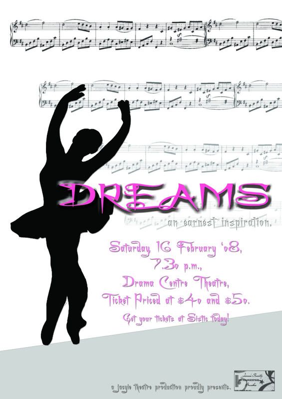
i am so not into momentum yet when i had to design the poster.. all i could think of was the use of light and cheery colours to bring out the emotions of the viewers and also to limit the colour used such that the poster will be simple yet not too complicated.. so i chose colours ranging from the tones of black and white, as well as pink..
i wanted to avoid using any human expressions which may distort and lead the audiences' train of thoughts so i thought of a simple silhouette of a ballerina.. which could bring across the storyline - about a ballerina - as well as a wider room for imagination to the audiences.. so i took a photo of a ballerina and changed it into a silhouette..
furthermore, i intended for the fonts to bring out a more romantic and curvy feel.. together with the sense of smooth and gentle movements of the dance itself.. after trying out several fonts.. i tried with charming font.. but.. i guess it brought out a little surrealistic feel instead..
the play being a musical.. i thought it will be pretty much relevant to include some musical notes and scores, such that the impression of a musical is clearly brought across..
and thus, the final product, for critique. *