DREAMS - critique and editing.
well, i expected a lot of comments from this poster.. hee.. afterall, it's not even what i exactly expected it to be..
so i guess there'll be major major changes to the poster.. however, the main theme will still be kept..
comments were.. the silhouette made the girl feels like a guy.. the musical notes were to stiff and straight and thus, the elegance and gentleness of the dance, ballet were not efficiently brought across..
personally, i felt exactly the same too when i got the poster printed out and seeing it in hardcopy.. the colours kinda look plain and dull.. not drawing my attention at all.. =x
besides, the font on print looks gothic, to me.. that has to definitely go.. oops.. heehee..
it was then a time of reshaping and putting together images and text to make the poster something that i'll really really expect.. (:
so it's another time of planning..
retook a photo of the ballerina, in several positions.. and then silhouette some of them and finally selected one.. which i thought portrays the girl more obviously.. in order to make the poster sightly more colourful and attention-seeking.. i decided to have a black background with coloured silhouette instead.. so i chose.. PINK and PURPLE - the two complementing colours that signifies SWEET ROMANCE..
with this in mind, i had to search for MORE fonts! the limited fonts on my lappy wasn't enough to bring out any gentle and elegant touch to the poster.. tried and experimented with some fonts and decided to use the more curvy font - freebooter..
then comes the hard part.. i had to make the musical scores wavy.. spent sometime on it.. and YEAH! done.. heehee.. together with the musical notes that surrounds the body of the ballerina..
i was hoping to achieve the thought in the audiences that music and dance are never separate.. they come together, in the same tempo and conveys, in the same emotion..
the initial plan was to include more details to the play, like descriptions and critiques of the play.. which looks like,
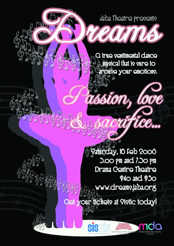
but, at the look of it.. it looks really heavy on the right side with the huge amount of text that appears there.. so i took out all the descriptions and thus,
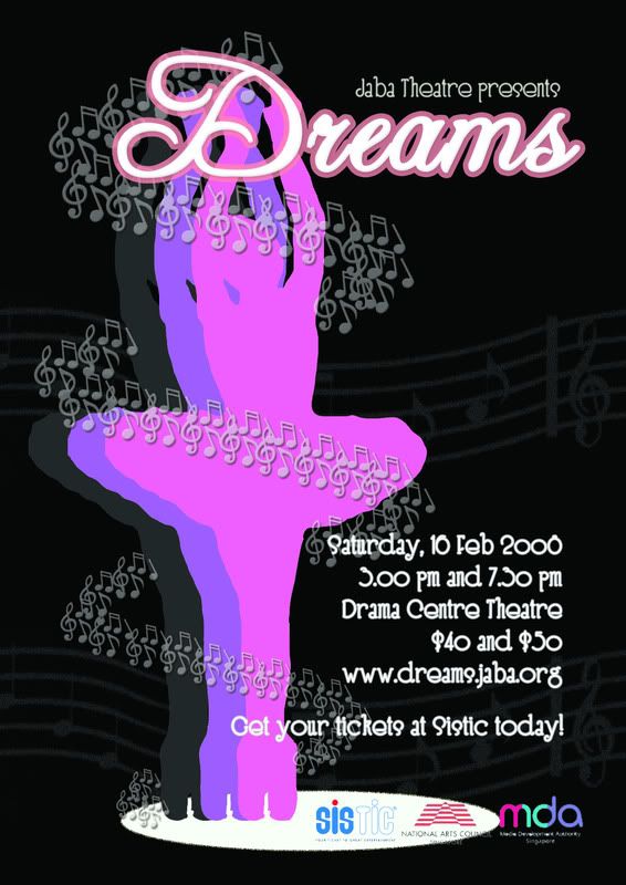
and now, it looks........
i have no idea too.. just slightly neater and clearer.. but it doesn't exactly feel balanced.. hmmm.. i hope i could improve further.. suggestions, anyone? (: